Completion requirements:
- View
Encountering a new set of data is like a trip to a new place. You need to research it carefully, find out where everything is and what connections exist between the different parts. In this section, you will learn a few techniques that will help you in our adventure with data.
We start every machine learning task by getting to know the data set. If we use tabular data, we are interested in what attributes appear, what values they have, and whether some of them may be related. When we work with other types of data, such as text, we are usually interested in whether all the texts are written in the same language and how long they are. Since no data set is perfect, In the analysis, we try to find potential duplicates and some atypical entries. All of these tasks are called exploratory data set analysis . Exploratory Data Analysis (EDA). Its goal is to help us, through a diverse set of tasks, to get to know the data set better and to make further decisions regarding data preparation more informed. Given the importance of data in the next steps (remember the saying "garbage at the entrance, garbage at the exit"), we try to devote enough time to exploratory analysis of the dataset and move to the next step only when we are sure that we understand the data.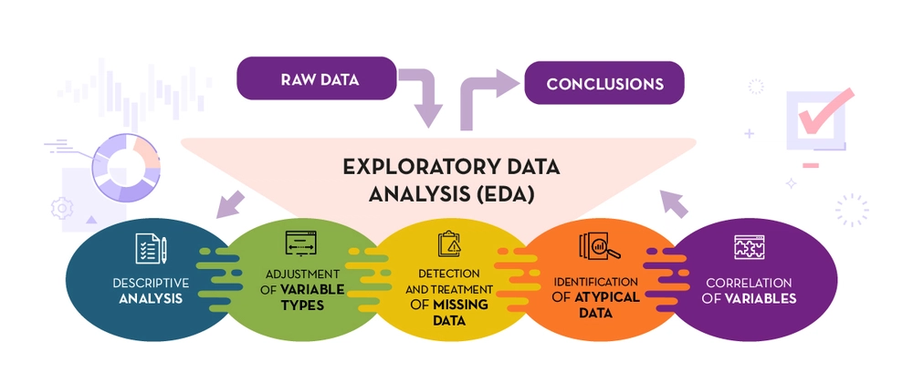
Exploratory Data Analysis Tasks
Attribute analysis
Since attributes are used to describe a wide variety of properties, their types and ranges of values vary. The two large groups of attributes that we encounter are numerical (quantitative) and categorical (qualitative) attributes. Numerical attributes have, as the name implies, numerical values. Such are, for example, the height of the player, the distance from the airport, the number of pets, the outside temperature, the number of ice creams sold, the concentration of glucose in the blood and many others. For these attributes, we usually look at the value ranges, the highest and lowest values, the average value, the median, as well as the distribution itself. We call all these analyses - descriptive analyses, because they help us describe the quantity to which an attribute is associated.
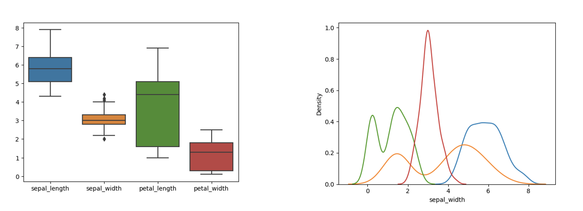
Examples of some descriptive analyses of the attributes of the Iris dataset
Categorical attributes are a type of attribute that can have a finite set of values. Such attributes are, for example, the color of the car, the type of clothing, the sex of the patient, the current season, and others. These attributes are usually represented by strings or equivalent numeric codes. For example, the month of the year can be listed as the name "February" or as the number "two" (because February is the second month of the year). It is important to note that even if we use numeric codes to represent these attributes, it makes no sense to calculate values such as average or maximum because these values are not inherently numeric. For them, we usually analyze what values they can take and how often they appear, and we show these conclusions using graphs.
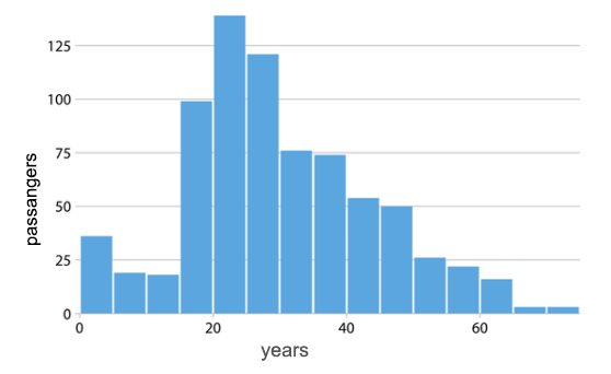
An example of the analysis of the attribute "year" in the set Titanic
The Unification of Values
In the course of analyzing the data, we can find that the attribute values are not uniformly set. For example, color names may be spelled inconsistently, sometimes in lowercase and sometimes uppercase letters, or dates may be given in different formats such as day-month-year and year/month/day. In order to be able to carry out the task of analysis correctly, it is desirable to unify these values, i.e. Let's reduce them to the same way of representation. Usually there is a way that is more desirable or useful, but it also happens that the elections are completely equal.
Missing values
When analyzing a data set, we may notice that the values of some attributes are missing. This may be due to carelessness in data entry or simply unavailability of information. Such values in the data set are called missing values.
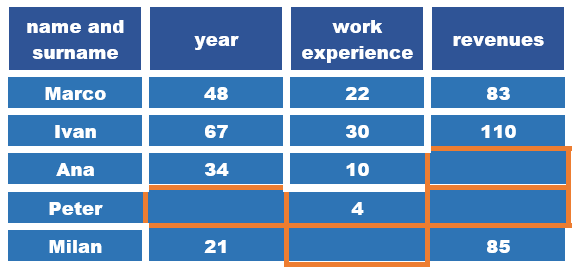
An example of a set with missing values
The simplest step we can take when we notice missing values is to delete either the attributes (columns of the data set) or the instances (types of data set) in which they appear. For example, if we don't know the value of an attribute for more than 50% of instances of a data set, it makes sense to delete it. If, on the other hand, we have only a few instances in which the value of the attribute is missing, it is best to delete the instances and keep the attribute. However, these decisions are not always easy. For example, it can happen that different attribute values are missing in different instances, so we delete and ignore a significant number of instances in this way, which can be problematic if we do not have a large set of data. That is why it makes sense to consider some more options in working with missing values.
If the missing attribute is numeric, for example, the distance to the airport or the height of the player, we can replace the missing values with the average value of the known values. The argument we have for this choice is that we will use the information that already exists in the dataset and that we will not change much about some other attribute properties. On the other hand, if we are talking about categorical attributes, such as the color of the car or the country of manufacture, which can have a finite set of values, we can replace the missing value with the most common value. Another option that is valid for both numeric and categorical attributes is the use of random values - so we can replace the missing color with a random color from a possible set of colors, and the missing height of a player with a value from the range of the smallest and highest height in the set. In all cases, we must be careful because changes in the data can affect the success of the model and the results we obtain. It is also very important at what point we make these repairs. We'll talk about that later on.
Duplicates
The presence of duplicates in the dataset can affect the generalization power of the model. That is why it is always convenient to check whether there are any data that are repeated or very similar. When it comes to tabular data, duplicates can be found by directly comparing attribute values. When working with different types of data, we usually need more advanced techniques. For example, duplicate images can be symmetrical, like in a mirror, either horizontally or vertically. It's the same with textual data. Two news stories may contain the same announcement (reported by some news agencies) with slightly different headlines, so in terms of direct character comparison, they are different, yet the same.
Spotting exceptions
Noticing data that is in some way different from the rest allows us to spot errors in the data or discover new, atypical behaviors. Such data is called exceptions or outliers. The distance from the airport, which is -1.2 km, would be a discrepancy figure because we expect the distance to be a positive value. That way we could spot the mistake and correct it. On the other hand, a temperature of 45 °C is also an unusual value , but a real one due to climate change and perhaps very useful as information for taking certain steps and actions .
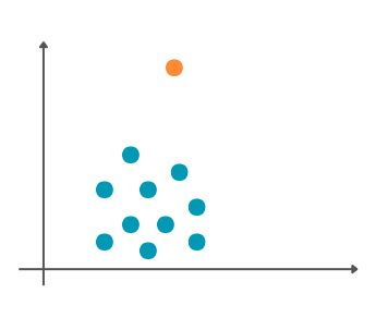
Graphical representation of the discrepancy
Discrepancies can also affect the outcome of machine learning algorithms. That is why, once they have been spotted and processed, it is important to decide whether they should be kept or deleted.
Attribute correlation
Attributes can be related to each other. We can see the connection if we draw a graph that has the value of one attribute along the x-axis and the value of another attribute along the y-axis. For example, we can track pairs of attributes outdoor temperature and the number of ice creams sold, outdoor temperature and electricity consumption and outdoor temperature and the number of books in the library. Let each of these pairs correspond to a graph like in the picture below. We can notice that the increase in temperature is accompanied by an increase in the number of sold Ice cream. If the increase in the value of one attribute follows the increase in the value of another attribute, we say that they are positively correlated. On the graph we can also notice that this dependence is linear, i.e. that it follows an imaginary line that passes through a set of points. On the other hand, it seems that the situation with the outside temperature and the consumption of current is somewhat different, i.e. that the decrease in temperature is accompanied by a higher consumption of electricity, Probably due to the use of heaters. Attributes in which an increase in the value of one attribute is followed by a decrease in the value of another attribute are said to be negatively correlated . From the graphic, we can conclude, again, that this kind of correlation is linear. The third graph, which shows the external temperature and the number of books in the library, does not indicate any, at least not obvious, regularity between the attributes. We can certainly conclude that these attributes are not linearly correlated.
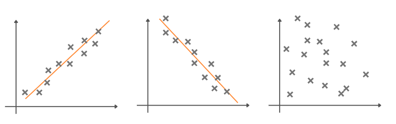
Attribute association graphics
To measure the linear relationship of attributes, we can also use different types of coefficients that are established in the domain of mathematical statistics. One such coefficient is Pearson's correlation coefficient. Its values range from -1 to 1 and indicate both the direction and the strength of the connection. Coefficient values closer to -1 indicate negative correlation, coefficient values closer to 1 indicate positive correlation, and values around zero indicate the absence of linear correlation.
It is common for the values of correlation coefficients between attributes to be displayed graphically in the form of a so-called heat map. Each square in this map corresponds to one pair of attributes and its color is adjusted to the value of the correlation coefficient. The column located on the side of this map connects the values and shades of colors. By observing this map, we can easily see the correlations in the data. The figure below shows the pairs of attributes of one data set that combines information about the Employees. Although we know little about this set, we can conclude that experience and the number of years (age attribute ) best track salary values. We can also see that there is a correlation between the number of years (the age attribute ) and the experience attribute .
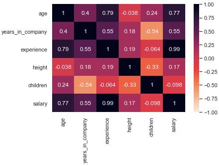
Heat map with values of the correlation coefficient
Spotting the attributes that are related allows us, first of all, to better understand the domain to which the data refers. Some connections can be expected, while others can bring us new knowledge. By deleting attributes that are linked, we can reduce the dimensionality of the data set. In this way, we can speed up the work of some algorithms and understand the results more easily. There are also machine learning algorithms that don't behave well if there are associations in the dataset - deleting attributes for which this applies can improve the success of the algorithm.
This lesson is paired with the Jupyter notebook 03-exploratory-data-analysis.ipynb . If you want to practice the tasks we have described, click on the link and then on the button  to open the content in the Google Colab environment. If you view the notebooks on your local machine, find the notebook with the same name among the contents and run it. For more detailed instructions, see the Hands-on zone section and the lesson Jupyter exercise notebooks .
In the Jupyter notebook, using the functions of the Pandas library, the data of the Titanic set was analyzed. This set contains information about passengers who were on the famous ship Titanic when in 1912, sailing in the Atlantic Ocean, it hit an iceberg and was shipwrecked.
Last modified: Saturday, 12 April 2025, 8:25 AM